

TINY
TALES
A (Modified)
Google Ventures
Design Sprint
BACKGROUND
My second major project for a UX/UI Design certification course. The goal was to understand and design a solution for parents experiencing frustration on an app that provides stories to read to their young children. It was a case of the app's content success causing problems for its users. To solve this design challenge I was to find a quick solution using the Google Ventures (GV) Design Sprint process, which is a faster, more flexible design methodology often used by “agile” teams.
DESIGN PROCESS
I used a “modified'' version of the GV Design Sprint because I was working alone (no team), although I still followed the general GV Design Sprint steps.
Created as a faster alternative to the traditional and rigid Waterfall Design method, the GV Design Sprint helps companies shortcut a long and expensive design process that frequently takes months, and instead, gain answers to critical business questions in just five days. The compressed process centers around rapidly ideating, prototyping, and testing ideas with customers to learn the value of those ideas before building out or launching anything. Consequently, businesses are able to validate and confidently move forward with the development of good ideas, or pivot quickly from bad ideas, before investing any more money and time into them.

The sprint gives teams a
shortcut to learning without
building and launching
DESIGN PRACTICES USED
Each Day of the GV Design Sprint is dedicated to specific, fundamental tasks:
Day 1: Understand/Map
Day 2: Research/Sketch
Day 3: Decide/Storyboard
Day 4: Prototype
Day 5: Test

MY ROLE
Sole UX/UI Designer
SOFTWARE USED
Figma, Miro, Zoom
Day 1: Understand/Map
Day 1 is about understanding the problem, and mapping a path toward a solution. Armed with some company background information and user research, I dove right in.
THE PROBLEM
Tiny Tales is a start-up, tablet app, where authors and illustrators can publish stories for parents to read to their children. Their library includes short stories, illustrated books, educational stories, and much more.
The growth of Tiny Tales and the increase in content has led parents to become overwhelmed and frustrated by the amount of time it takes to find appropriate stories for their children.
SYNTHESIZING THE RESEARCH
Persona
I read through the user research that was provided to me, did some of my own affinity mapping to synthesize user sentiment, and compared it to the persona, Claire, that had been created from the research. Claire’s profile supported my own synthesized understanding of the users’ behaviors, frustrations, and goals.
Claire has a wide range of criteria she uses to evaluate what makes an appropriate story choice for her children, including the topic, age level, learning points, overall entertainment value, and quality of the story. The amount of time she spends searching for a story that fits that criteria is clearly a burden to Claire, who has limited time, and wants to spend that limited time having a quality experience with her children. She also wants to instill a love of reading in her kids, encouraging them to investigate topics that interest them, and ask questions about those topics. Her current experience finding stories on the Tiny Tales app is making it difficult to achieve those goals.

STARTING AT THE END
The discussions that occur on day-1 of a Design Spring are to ensure everyone involved is working with the same set of expectations. The best way to do that is to “start at the end”. In other words, consider and agree upon what you would like to achieve by the end of the Sprint. With that in mind, although working alone, I did two important things: 1) I set a long-term goal. 2) I created a list of questions that I would hope to have answered by the end of the Sprint.
Setting a long-term goal
I set out to choose a long-term goal that would be ambitious, one that reflects the company’s principles and long-term aspirations. To arrive at this goal on my own I began by reaffirming why exactly I am doing this project for Tiny Tales?
The answers seemed bleak for the company if a quick solution to Claire’s problem wasn’t found:
Because parents currently find the process of choosing a story to read to their children on Tiny Tales too long and difficult. Their experience is counter to the positive experience they are looking for with their children. Tiny Tales wants to provide a good user experience for both the parents and their children. The current process is not satisfying them. If their experience with the app is bad, parents may give up on the app (decide the time spent is not worth it) and that would mean loss of business.
Having considered these answers I set out to reverse this negative sentiment and set this long-term goal
Provide a really positive experience to users so they will recommend the app to others
Creating a list of questions tied to this goal
With my overarching long-term goal in mind, I made a list of potential questions to be answered during this Sprint, these questions were both positive and negative, uncovering potential roadblocks that would prevent the goal from being achieved
-
Can the story search process be made faster while remaining easy?
-
Does the technology exist to narrow the search choices by multiple categories?
-
Can the search choices remain fluid so the criteria can change over time?
-
Can we still keep kids involved in the process of choosing a story?
-
How many steps is a parent willing to take to pick a story?
MAPPING
Once the long-term goal and questions were in place, I created a diagram indicating the customers or key players who would be affected by the Sprint, and mapping their route toward achieving their goal. In this case, the key players would be a parent and their kids. The map represents the steps they need to take to find the right bedtime story.
The map also begins to provide structure for the solution sketches and prototype. In this map, the optimal, main task is to narrow the list of story choices by some kind of criteria.

THE TARGET EMERGES
The Map clearly reveals the parent, not the child, as the party with the greatest interest in filtering the list of stories by specific criteria, so they get the first crack at narrowing the list and the Sprint will focus on solutions targeted toward the parent. Once the parent has narrowed the story choices, the children are then able to pick from the curated list. In this way, the process is simplified for both the parent and the children, and the children still have a way to remain involved in choosing a story.
DECIDING ON A “How Might We” QUESTION
I chose this HMW question because I felt it provided the greatest possible flexibility for each parent to define their own story search criteria, but also took into consideration the common desires parents had for a speedy process and an enriching experience for their child.
HMW help parents to quickly narrow the story options on the app, using criteria they choose, in order to shorten their process of picking a suitable and enriching story to read to their children.
Day 2: Research/Sketch
Day 2 is about finding a solution to the problem at hand. The GV Sprint process usually involves everyone doing quick research and presenting to the group (aka 'lightning demos’) ways other companies have dealt with similar problems. The idea is not to copy, but to draw inspiration for a solution that is specifically suited to the Tiny Tales target. Then everyone sketches possible solutions.
RESEARCH
A solo version of "Lightning Demos'. To get inspiration and see how other companies have addressed the problem of quickly filtering their content, I looked at other children’s media sites, book sites, and even retailers and travel companies for ideas. Here are a few that I found useful:
Common Sense Media
Common Sense Media Is a non-profit organization providing ratings and advice to parents on children’s media. It has a variety of ways to filter content. One useful screen allows the user to filter by multiple ages or age ranges. This is useful for parents who are reading to more than one child and need content suitable for multiple ages. Other filters include genre, topic, rating, character-building qualities, etc.


Epic
Epic is a children’s story app that immediately asks that you register your child, their age, and then makes suggestions accordingly. They have numerous ways to search, sort, and filter content. Most interesting was a general search box for keyword searches of topics, titles, authors, and more which seemed like a good general location to begin a search. Results of the initial search can then be narrowed further by adding more filters (ie. age, reading level, genre, etc.)


Bookful
Bookful is another children’s story app. I liked that the book description includes how much time it would take to read the book, the reading level and the number of pages in the book. All very useful information for our Tiny Tales user.


Goodreads
Had a number of ways to pick a book, mostly through categories. Filtering was more tricky unless you knew exactly the book you were looking for. I liked the pop-up screen upon choosing a book and the ability to add it to a “want to read” list.


Zappos
I continued my research by looking at retailers who frequently need to help their users filter content. Zappos does this very effectively. Users can begin a search with keywords in a search box at the top of the app. They not only use expandable categories, they highlight the category choices, making it clear what filters the user has chosen and giving them the option to remove or change the filters whenever they want. Upon opening a product, the user can save items into a favorites folder. The “favorites” folder can be sorted and filtered as well. In general, the needs of the Zappos user are very similar to the needs of the Tiny Tales user and the Zappos filtering and sorting solution would work well for Tiny Tales.


Kayak
This travel app places their filtering categories across the top. Upon clicking on each one a pop-up allows the user to filter in that category. Once filtered, the category is slightly shaded so users know which categories are filtered. Heart icons alongside results cards allowed for saving into a favorites folder.


SKETCHING
Crazy 8s
After getting some inspiration from these different apps, I decided on a filtering concept because it would be the fastest in removing content that was irrelevant to the user, and reduce the time and effort required to find a story. I used a sketching technique called crazy eights to create rough sketches that would visually convey my thoughts of how some of those screens would work specifically for Tiny Tales users.

The Solution Sketch
From my crazy 8 ideas, I settled on the concept I thought would work best in this situation and developed a Solution Sketch. The most important frame is in the center, and represents the intended method for filtering the content. The other two screens represent the screen leading into the solution and the screen following the solution, or in this case, the result of the action taken by the user. I chose this particular solution because it keeps the filtering options and the indicators of their choices in one general area (the left side). By keeping it all on the left side, the user’s eye doesn’t have to move all over the screen to get confirmation feedback of their choices and I believe that will help reduce cognitive overload.

Day 3: Storyboard
Day-3 is decision day. The group typically chooses a sketch to move forward with, and creates a storyboard detailing the anticipated user experience. The storyboard is detailed enough that it provides a framework for the prototype to be developed on Day-4.
STORYBOARD
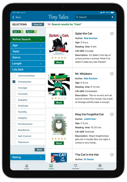
Creating a storyboard allowed me to put my design and solution ideas into context. I drew a grid of squares and filled each square with the different steps my persona Claire would need to take to quickly find the right bedtime story for her children. The opening scene is Claire getting her kids ready for bed. The kids choose a story topic and Claire enters it into the search box. The resulting screen is an overwhelming number of stories, but the ability to refine the search is highlighted and evident. Claire is then able to filter the results by her children’s ages, a life skill she wants to teach them (compassion), and ratings from other parents. The initial overwhelming number of options is narrowed down to just 3 books that Claire is confident will be age-appropriate, provide a life skill, and is vetted by other parents. She can then either let her kids choose from this narrow list of results or pick the story herself.

Day 4: Prototype
On Day-4 the prototype that will be used for testing is created. This is not a fully functioning app, rather a realistic enough simulation to garner a response from the target audience and inform whether or not this is an appropriate solution.
DESIGN WITH A FOCUS ON THE SOLUTION
I used Figma software to design my prototype. Working as quickly as I could, I either collected or designed all of the elements that are typically found on app pages, including logo, imagery, icons, buttons, entry fields, and typography compiling them into the prototype. My goal was to create an experience that felt as realistic as possible. My emphasis was on the story filtering screens designed to solve the user’s problem so I spent more time refining that process vs. further building out the home screen or even the final book page.
 |  |  |
|---|---|---|
 |  |  |
 |  |
The Prototype in Action:
Day 5: Test
Day-5 is test day. The make-or-break evaluation of whether or not this solution will work
A ZOOM USABILITY RESEARCH LAB
Given the inability to test in person (due to a global pandemic), I recruited 5 parents with young children who regularly read to them at bedtime and conducted usability tests over Zoom. Although a few of these interviewees are married to each other, I tested the prototype with each person separately to ensure they did not influence each other's responses.
Interviewees:
Tara and Mike
Parents to 2 kids ages 1.5 and 5
Since the kids are so far apart in age, they generally read to them separately. They rely heavily on parent reviews and ratings to help them choose stories appropriate for their own kids. They have favorite authors that they trust to deliver the kind of content they deem suitable.
Shoshana
Mom to 3 kids ages 5,8 and 11
The oldest child is in middle school and generally reads on her own. The younger two like to choose the topics for their bedtime stories, although they currently have completely different interests. As a result, sometimes they share a story, but generally, they are read to separately.
Alex and Christopher
Parents to 2 boys ages 9 and 12
The oldest son mostly reads on his own now but they still read to their younger son at bedtime. As the younger one transitions into a reader, the stories they choose are not only for the parents to read, they also pick stories that their son can practice reading to them.
Overall Reactions
The concept of filtering and the short amount of time it took was really well received:

Functionality Successes
-
All instinctively (and correctly) began by typing the topic “cats” into the search bar on the home page.
-
Upon getting their first results, 4 out 5 test interviewees began to filter by age right away.
-
The process of opening the filter categories, making choices within them, and saving was intuitive for all.
-
All noticed the changes in search result numbers after filtering by a given category.
-
All seemed to find the story details on the cards useful (Title, author, age range, reading time, life skill, description, etc). Some seemed to take that information for granted, while others specifically called out their usefulness.
Functionality Struggles
Most of the struggles simply came from the limitations of a not-fully-functional app since the sheer number of possibilities for filtering were too many to activate in a five-day sprint. Having access to only one specific path (red route) and a predefined order in which the users could make their choices, led to some confusion and need for some prompting during the test session which could potentially compromise the results.
-
Some users wanted to filter age by ‘range’ with the instinct of clicking on 4/5/6 vs. 4&6.
-
Some chose the wrong predefined order clicking on age 6 before age 4, or 4 stars before 5 stars.
-
Some were inclined to hit “save” before selecting the second pre-defined age or rating.
-
One user wanted to filter by more than one “life skill” but was unable to.
-
One user (out of the five), upon landing on the initial results page, remained fixated by the books and completely overlooked the filtering categories…she believed she would have ultimately seen them unprompted.
-
One noted he’d never filtered by “Life skill” and seemed skeptical. (Common Sense Media calls this same category “Character strengths”). Perhaps that title might have been more familiar.


THE GOOD NEWS
Despite these testing challenges, all had the right instincts for opening the filter categories and making choices within them. Furthermore, all believed that realistically, if they clicked around the app once to figure out how it worked, they would have no more issues. Still, it’s worth exploring if the experience would improve by the app automatically filtering as they make each filter choice without having to hit “save”.
RESEARCHER'S PERFORMANCE
Reviewing the recorded sessions was useful to self-evaluate my research methods. In general, I believe I did well, but there was definitely room for improvement. Following the five-act interview method, I tried to put the interviewees at ease, explained the process, learned a little more about them, and asked the right open-ended questions. However, I sometimes did not wait long enough for answers before jumping to another question or clarifying in some way. In both of those cases, I probably missed opportunities to gain useful information. I found that I need to slow myself down a little more and be more comfortable with the users’ thoughtful pauses.
Reflection & Next Steps
REFLECTION
GV Sprints are Better With a Team
I’m not sure if it’s because I was learning the process of a GV Sprint while doing this project, or simply because I had no team, but I definitely struggled to move as quickly as the prescribed 5-days. My guess is that It was a combination of the two. Having been given some online content to read as my guide to the GV Sprint, there were sections that didn’t make a lot of sense to me, so I bought the Sprint book to dig deeper and hopefully better understand the big picture…which did help. But obviously, some of the tasks don't apply when you are working without a team, or take much longer if you can't divide and conquer. Reconciling that difference from a time perspective was frustrating to me.
One of the most challenging aspects for me was reconciling what happens with a team on Day-1 vs. doing it alone. Reviewing and synthesizing the user research was intuitive to me, so was drawing a map and writing an HMW question. But choosing an overarching goal, the list of questions, and consulting the experts were more difficult, not because the tasks themselves were more difficult, but because I was having trouble figuring out the order of the process and whether or not (or how) to incorporate some “team” tasks by myself. There are no experts to consult, and no dots necessary for voting… just to name a few. So is the user research supposed to be my “expert”??? Isn’t that the first thing I do? Read the research to get my background information? If that’s the case, how do I “start at the end”???
Likewise on Day-2, for my solo “lightning round”, investigating other companies who deal with similar issues for design inspiration took a while. So did gathering assets for the prototype on Day-4. Dividing and conquering in a team environment, as is typically done, would have come in very handy in both of those situations.
In the end, I managed to get it done alone, albeit slower. But I think the design concept was a success. I also gained a good understanding of the GV Sprint process and feel confident that I could get through it significantly faster next time, whether my next opportunity is with a team or on my own again.
NEXT STEPS
Overall, the information gained from the test was useful and I would say that a content filtering system, along the lines of this one, would greatly improve the experience parents are currently having on the app.
I think I was also able to answer all of the questions we wanted answers to at the beginning...except maybe the last one.
-
Can the story search process be made faster while remaining easy? yes
-
Does the technology exist to narrow the search choices by multiple categories? yes
-
Can the search choices remain fluid so the criteria can change over time? yes
-
Can we still keep kids involved in the process of choosing a story? yes
-
How many steps is a parent willing to take to pick a story? Still not sure
However, given the trouble that occurred when interviewees didn’t filter using the prototype’s prescribed order, it would be worth testing that aspect some more, to see if instant filtering works better than waiting for the user to make all of their filtering choices in a category and then hit save.
Appendix
WORKS CONSULTED
Carter, Eric. “Solve Problems and Test Ideas Faster with Google Ventures' Design Sprint Framework.” Zapier.com, 28 Apr. 2016, https://zapier.com/blog/google-ventures-design-sprint/#1.
Formica, Joe. “TinyTales-Springboard Design Sprint.” Bitesizeux.com, Bitesize UX, 2022, https://classroom.bitesizeux.com/library/tinytales-springboard-design-sprint-42234/85684/path/.
“From ‘Sprint’: The Five-Act Interview”. YouTube, uploaded by GV, 9 Mar. 2016 https://www.youtube.com/watch?v=U9ZG19XTbd4.
Knapp, Jake. Sprint: How to Solve Big Problems and Test New Ideas in Just Five Days. Penguin Books, 2021.
“The Design Sprint.” GV.com, Google Ventures, https://www.gv.com/sprint/.