
SUPREME CYCLERY
Helping customers gain the confidence to complete their online purchases.
Case Study

My Role
Sole UX/UI Designer
Design Methods
Research, Personas, Site Map,
User Flows, Ideation Sketches, Wireframes, Branding, HiFi MockUps, Usability Testing.
Constraints
Project timing limited to 90 hrs. Designed from scratch without access to the current website.
Tools
Figma, Miro, Zoom
OVERVIEW
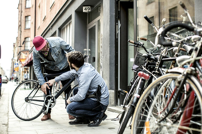
Supreme Cyclery was a bicycle retailer struggling to convert visitors into sales through their E-commerce channel. Their analytics seemed to indicate customers were interested in the company's products but reluctant to follow through on their expensive purchases. Stakeholders believed their customers were not confident about their product choices. And those who were ready to buy, seemed unwilling to create an account when it came to checking out. In both cases, they would simply abandon the site.
ANALYTICS INDICATORS


Could this be why?
Product Confusion
Users may be having difficulty figuring out which bike is best based on the relative features.
Unwilling to Register
Requiring users to create an account to checkout, could be hindering the conversion process.
THE CHALLENGE
My job was to design a new user experience and interface that would empower users to trust their choices and follow through with their purchases, including a guest checkout option that would still capture the customer's email.
IMPROVE METRICS
Increase revenue by improving conversion metrics from browsing to purchase completion
GUEST CHECKOUT
Design a guest checkout that captures users’ email to see if that encourages follow-through.
How might we give users the confidence that the bike they are choosing on Supreme's website is the right one for their needs so they will complete their purchase?
THE APPROACH
LEAN UX DESIGN
Restricted to just 90 hrs. to complete the project meant I needed a fast design solution. I opted for a "Lean UX" design approach, known for its time-saving, user-centric efficiency. The plan was to learn about the market, the user, and their expectations through Secondary Research and a Competitive Analysis. That would allow me to hypothesize about the user's needs and ideate/design solutions with a focus on creating an MVP. To validate the designs, I would conduct usability tests, gathering more insights from users through conversation. Then, I would iterate, improve the features and processes, and test again, quickly striving for the right solutions.


LEARNING
Through research, a picture emerged of our users and their needs and served as a launch pad for understanding, empathizing, and addressing those needs.
DISCOVERY
BIKE BUYING MOTIVATIONS
I gathered information from industry studies, reports, articles, blogs, and social media commentaries. Combined, they revealed insights into the state of the industry and what was motivating people to buy a bike. I listened particularly closely to individual sentiments on social media sites, like Quora, that asked relevant questions many people responded to. These were the top reasons people were motivated to buy a bike:

Improved Trails
& Safety

Improved Trails
&
Safety

Health
& Fitness


Competition
Community

Outdoor
Exploration
Environmental
Responsibility

Pandemic
Social Freedom
Fun! Fun!
Fun!
SYNTHESIS
PERSONAS
Two PERSONAS emerged from the secondary research. While their motivations for buying a bike were somewhat different, both user groups indicated a desire to better understand the product offerings and have access to trustworthy purchase advice.


AVID CYCLIST MIKE
BACK IN THE SADDLE JULIA
The vast majority of bike enthusiasts fell into the user group represented by “Avid Cyclist Mike”. These cyclists were mostly wealthy, white, educated, men, who owned multiple bicycles and cycled 3-5 times per week, generally on paved streets and bike paths. This user group bought their cycling gear at their trusted local bike shop but also did significant shopping for gear through online retailers. Well-versed in bicycle features and benefits, they were often driven to shop online by the lack of specifically desired inventory at their local bike shop (size, color, or other detail). However, they still sought expert product knowledge on those sites and had concerns about the reliability of unfamiliar sites’ advice. Additionally, they worried about the ability to return items purchased online. Establishing credibility and assurances of a liberal return policy were important for this user.
The second user group represented by “Back in the Saddle Julia” was less specific in terms of demographics, but had clearly emerged due to environmental concerns, health/wellness, infrastructure improvements, and social/fun factors I mentioned previously. The pandemic served as a huge catalyst for the growth of this group, enticing many back into cycling or inspiring a significant number to try it for the first time. In combination with the booming popularity of electric bikes that provide assistance while pedaling, this user group had been able to overcome some of the biggest objections to cycling, like the difficulty in riding up hills, allowing them to relish in the joys of cycling with less work. This group was not as well versed about the differences between bikes and needed more guidance to understand which bike was better suited to their needs.
COMPETITIVE ANALYSIS
EXPLORING OTHER BIKE SELLERS
Evaluating competitors helped to shed light on the tools and features used by other web retailers that shoppers had come to expect. Below are examples of three prominent retailers who sell bikes online… two big box retailers, and one popular cycling-specific retailer. Although I only documented these three, I looked at many more cycling and non-cycling retail websites throughout my design process for inspiration on the best ways to address specific feature challenges.


TAKEAWAYS
With a better understanding of our users and some thoughts on the features that would help them trust the company and their own choices, these features seemed key. They all made it to the MVP inclusion list.
Product Specs
Specific details of a given product and the related benefits to the rider.
Filtering Options
Ability to narrow the number products based upon the user's chosen criteria.
Product Comparison
A simplified way to compare multiple products at once.
Reviews & Ratings
Real world feedback from existing product owners vetting or refuting the advice of the bike seller.
Guest Checkout
A way to buy products without having to register on the site, regardless of the reasons.
Liberal Return Policy
Comfort in knowing there is a way to get money back if they make the wrong choice .

DESIGNING A SOLUTION
With user sentiments and requirements in mind, I began to conceptualize the architecture of the site, brainstorm ideas that included those critical features, and design a simple path to purchase completion.
ARCHITECTURE
VISUALIZING THE SITE
Creating a site map helped me to orient my thoughts about the architecture of the website and how users might navigate it.

IDEATION
SKETCHING
I sketched several different concepts. Some of those ideas seemed better suited for one user group or the other but would not have been the right solution for both. I wanted to keep the experience simple and consistent for all visitors to the site, regardless of their level of cycling knowledge and experience. Ultimately, I sketched some pages for the concept that made the most sense me.


USER FLOW
A PATH TO PURCHASE
Once I had a solid vision for the user's red route (path to goal completion), I created a user flow, depicting the path the user would need to take to achieve their goal of purchasing a bike. Beginning at the “Bikes Landing Page” through to “Order Completion”, it represents the pages, decision points, and information input necessary, from beginning to end.

WIREFRAMES
THE FIRST PROTOTYPE
I moved on to designing wireframes. Keeping it simple allowed for early testing of the design concept to ensure time is not being wasted on a concept that doesn’t work. As I designed, I continued to consult numerous other websites for best practices, especially throughout the checkout process. In doing so, I was reminded of important details I hadn’t considered before now, like checking that the billing and shipping addresses were the same, and what to do if the user wants to make a change at the end of the flow…how to do that without making them re-input everything. I was also particularly curious to understand why people were reluctant to register on the site.


LEARNINGS
INITIAL USER FEEDBACK
The good news was that the concept and features were well-received and users were ultimately successful in navigating the flow to completion. Although the goal was to test the usability of the design concept, I sought to get a deeper understanding of users’ bike-buying sentiments as they navigated through the prototype. So now that I had real users in front of me, I did not squander the opportunity to learn more about their bike buying habits and the pain points they experience, as well as ask “why” they had made some of their choices on the user flow, and what might be missing for them. The positive reception of the design was clear, but testing revealed an important usability issue and some unfulfilled user needs to address:
Compare Feature Issue
The “Compare” component that emerged as users chose bikes to compare was invisible to most users. The component was overlooked, so they couldn't figure out how to begin the comparison when asked to do so.
Improve Contact Capture
The experimental marketing opt-in on the Guest Checkout revealed that capturing Email & Phone was fine for delivery purposes, but adding “we will also send exclusive news about special offers and products” was a deal breaker for at least one user.
Show Return Policy
The ability to return the bike if they didn't like it was a repeated concern and needed a prominent answer as users navigated the site. This concern was tied to the reluctance to buy a bike without trying it first.
Solve Sizing Problem
Users were unsure what the right bike size would be to fit their bodies and needed a way to figure that out. This was an important feature in closing the sale online as users wanted to ensure the right fit before buying.
ADDRESSING USERS' NEEDS
As I moved to the next phase of design, I focused on resolving the problems that had emerged during the first round of usability testing.
STYLE GUIDE
A NOTE ABOUT BRANDING & STYLE
With this second iteration of the design, I moved into high fidelity. As part of the conceptual website redesign, I was tasked with naming the company, designing a logo, and creating the complete look and feel of the site. I chose the name Supreme Cyclery with the brand personality of an expert in the field, who is always knowledgeable about the best products and latest trends. I felt this name would resonate with the larger target audience (Mike the Avid Cyclist) as they are known for being competitive by nature and would hopefully be drawn to and want to be associated with "the best" aka “Supreme” Cyclery. I also wanted the logo to be obvious in what it represented with the image of a bike, and to imply movement or speed.
For the color palette, I wanted the website to feel light and energetic so I primarily chose blues on a white background, some gray, bright green accents, and dark brown typography. Collectively the colors represent the brand's attributes of Dependability, Trust, Focus, Intellect, and Security. And, I made sure all colors met accessibility guidelines. My typography choice was Lato which is a clean, simple, and easy-to-read font. Following is the style guide for the website:

ITERATING
KEY FEATURES & IMPROVEMENTS
As I iterated based on the user feedback I refined some user-validated features and incorporated improvements. Each feature was designed with the goal of helping users quickly dial into the product they were looking for. By removing extraneous information and then providing tools that help to inform and educate, I hoped to give users confidence and trust in the product and by extension their choice....resulting in a clear and easy path to purchasing the perfect bike.

PRODUCT FILTER
Designed to prevent users from getting overwhelmed by too many offerings, this feature allowed users to quickly dial in on the products that were most interesting to them. Chosen filters were highlighted near the top and allowed for their easy removal (one or all) if the user changed their mind.
PRODUCT
COMPARISON TOOL
Re-designed to draw attention to its location, this tool allowed users to do side-by-side comparisons of multiple products and their technical specifications. The user could navigate to each individual product page from this page and easily come back to compare some more. The presence of a call or chat link also allowed users access to additional expert advice.

SIZE CHART WITH LINK
The size chart allowed users to put to rest the question of what is the right size for them. Linked to the top of the product page, users could quickly navigate down the page to the chart and back to the top as needed. Measurements were listed in both inches and metric centimeters.
PRODUCT FEATURES & BENEFITS
The product page included both technical product specifications and less technical details with headings like "Why You'll Love it" and "It's right for you if..." making it possible for the user to better assess if this was the right product for their specific needs.


PRODUCT REVIEWS & RATINGS
An important element in validating the website's advice, user reviews & ratings give the user confidence that they are making the right choice and can be the tipping point for closing a sale. These reviews were placed directly on the product page. A hot link at the top of the page allowed users to scroll directly to them.
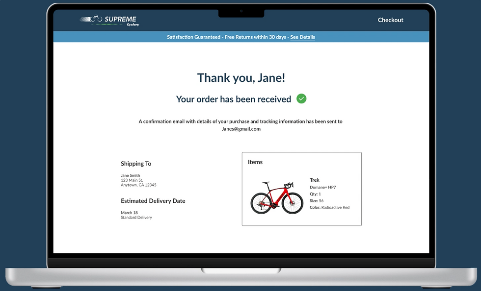
A GUEST CHECKOUT
As requested by the product team, this guest checkout would make it easier for users to complete their purchases without having to stop and register for an account. Included was also an option to create an account and some promotional enticement to do so.


CONTACT INFORMATION CAPTURE
The secure checkout included input fields for the users' contact information. It was made clear that this information was solely for delivery purposes. (The final version of the designs included a check box allowing users to opt-in to marketing emails).
A VISIBLE AND GENEROUS RETURN POLICY

I added a policy link to the header announcing “Free Returns within 30 days” visible at all times throughout the site. Hopefully, that would respond not only to the need for a bold return policy but also mitigate the desire to try before buying.
VALIDATION
TESTING THE UPDATES
The second round of testing was very positive. Users were enthusiastic about the features and website overall. They generally expressed that it included everything they would need to feel comfortable following through on their purchase.
REFINEMENT
SOME FINAL CHANGES
Despite the positive reactions during the second round of testing, some of the user feedback indicated a few more tweaks might further improve the user experience and business outcomes. The compare strip was fixed immediately after the first user missed it again in round two of testing, the new bright blue version performed perfectly with the rest of the users.
A VISIBLE "COMPARE" STRIP

"Compare" in closed state, still hard to find
To fix the invisible “compare” feature I re-designed it to pop open automatically upon choosing a bike to compare. That would draw attention to the feature's location. The user could then close it themselves and see where it lived, pinned to the bottom of the screen, they could open it again whenever they wanted. But as I began the second round of testing, the first user closed it and suddenly couldn't find it again. Ugh!
Problem solved! "Compare" in bright blue
After that first user, I rapidly changed the color of the strip to make it brighter and more prominent. Suddenly, users saw it clearly and easily understood how to use it. In fact, they loved the feature!
CONTACT INFO
WITH OPT-IN FOR EMAIL

The objectionable contact capture
Originally, to stimulate conversation about why users objected to registering on the site, I intentionally added a little note indicating they would automatically be opted-in to marketing emails during contact capture. Most of the users did not object and said they'd simply unsubscribe (not ideal UX). But one user strongly objected to the automatic opt-in saying he found it sneaky and would walk away from the sale. Overwhelmed by emails, he did not want to be on any more email lists.

A better contact capture with opt-in button
I removed the marketing disclosure before the second round of testing but continued the conversation. Users were okay with sharing email & phone on a one-time basis for delivery. Then a user said he would be interested in getting promotional emails but didn't feel like taking the time to register. Adding a check box and privacy link simplified the process of opting into promotional emails and gave the choice back to the user.
A BOLDER LANDING PAGE

Original home landing page
One user said he was a little disoriented at the beginning on the home landing page. Besides the existence of the corner logo, he was expecting a more prominent home page with a bigger Hero image. The untitled description below the image contributed to this confusion.

Revised home landing page - bolder image
I updated the home page with a full bleed hero image, a descriptive tag line and a bold call to action. This should help to orient the user and begin to establish credibility upon arrival to the site.
A WAY TO IMMEDIATELY ESTABLISH TRUST


A missed opportunity to establish trust
Credibility and trust through company history and cycling expertise
One user felt the site was lacking important information about the company’s history and authority on bikes, which if it existed, would provide more confidence in the product right off the bat. It was a really valid point. While this copy is friendly and informative, it misses the opportunity to immediately establish trust.
With the goal of establishing trust in the seller, I revised the home page copy to include the history of the company and the reasons to trust their advice. Doing this on the home page of the website sets the tone as an authoritative voice for the whole site.
FINAL HIGH FIDELITY DESIGNS
READY FOR LAUNCH


IN ACTION
BUYING A BIKE
NEXT STEPS
WHERE TO GO FROM HERE
LAUNCHING IS JUST THE START
It is important to note that to be "user-centric", the cycle of improvement does not ever really end. Looking at analytics will only provide clues about what vs. why changes might need to be made. To truly understand why a design is working or not working, it's critical to continually engage the users in conversation and testing, their perspective will reveal the real answers. Any other conclusions from analytics indicators are just speculation. Sales evolve from the users' comfort and trust in the brand and that only happens when users feel the brand understands and provides solutions to their needs.
As a UX designer I also never really feel like a design is "final". In my quest to delight the user and improve their experience, I will continue to see things I want to improve, every time I look at the designs. Even now, I would convert the “Need Help?” link into a floating symbol on the lower right side of the screen that pops open if a user is hanging out on any page for a while. That way it’s less obtrusive, but draws attention to itself when users might need help. But given the time constraints in this theoretical project, it is time to launch the designs and see if the changes help to stimulate sales. The floating button can be added to the next iteration.
REFLECTIONS
WHAT I LEARNED
DOES SPEEDY "LEAN" DESIGN COMPROMISE USER INPUT?
As I began this project I had major concerns about the time constraints and speed needed to complete the project. My biggest concern was that by cutting out primary research at the beginning, as is done with some "lean" design methodologies, my process would not really be user-centric. I'd have trouble learning enough about the user to empathize with their needs and therefore compromise the results from the start. To mitigate the chances of that, I spent a lot of time, during my secondary research process, looking at social media sites like Quora and Facebook where bike enthusiasts made comments about their interests and needs. That, in combination with other research sources, allowed me to build personas to design for, but it still felt like the “user's needs” I had identified were somehow just speculation. I guess that is the point with Lean UX, you are designing based on a hypothesis vs. a confirmed need.
I decided that if I chose well-qualified users during my wireframe test, instead of random users for “guerrilla testing”, I could spend the time not only evaluating the user’s process on the site but also discussing with them their cycling purchase habits and needs. I did this for both rounds of testing and it actually worked. In addition to asking “why” users were making certain choices, one question, in particular, bared a lot of fruit, “Is there anything objectionable or missing here that might prevent you from buying your bike at this site?” The question was broad, but it stimulated thoughts about the users’ real processes and concerns. And with those answers, I finally felt like I really understood the users’ needs and was designing real solutions. Testing became a two-for-one primary research and usability testing process which ultimately helped me design a product that I was confident met users' needs and expectations...in a faster time frame. Interestingly, my test users' answers lined up well with the personas I had created so it validated those positions too, but many of the final changes I made, evolved only from the conversations I had with users during testing. Ultimately, I believe dedicated primary research will always provide more insights. But in a time crunch, this "lean" method worked.
Thank you for your interest!
See more of my work:


